garden state community outreach
Campaign Identity | Motion Design | Print Design | Social Media | Web Design
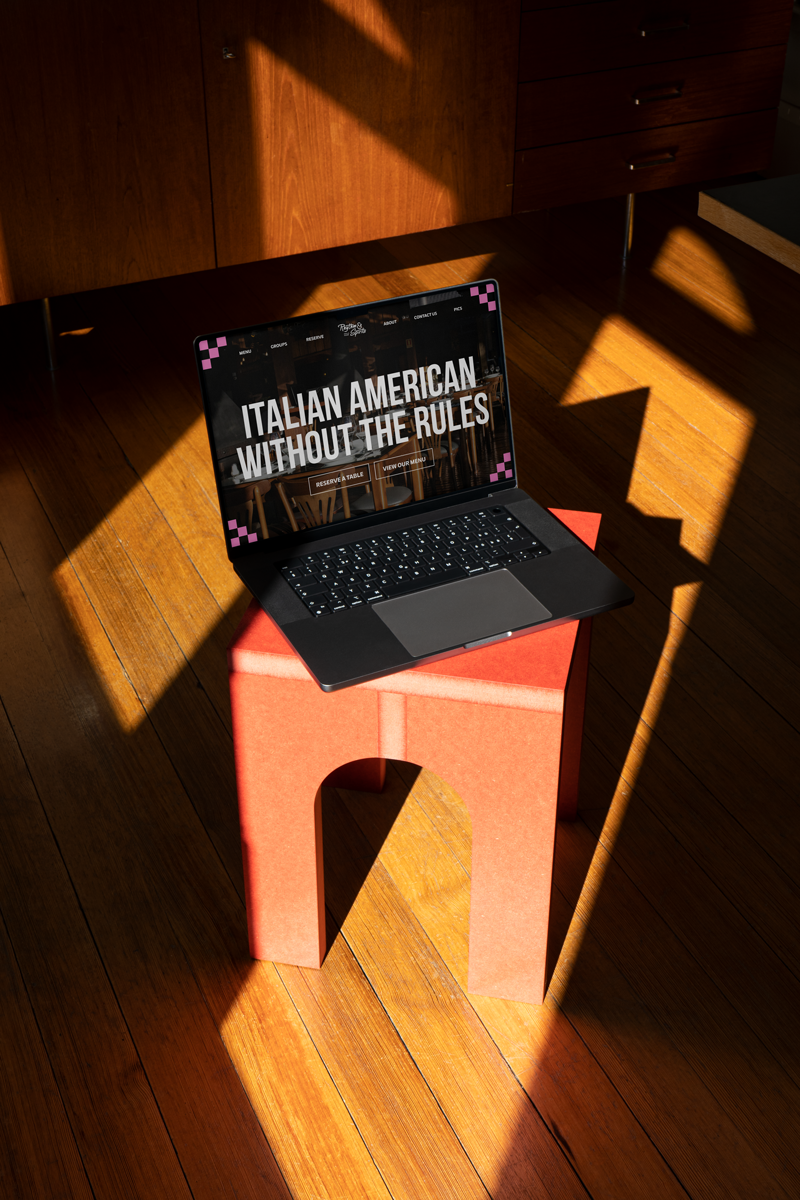
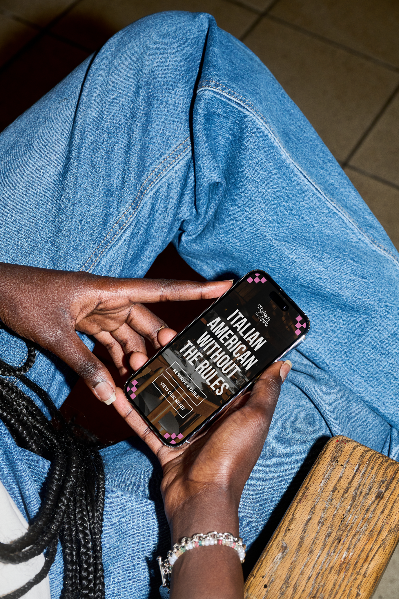
Rhythm & Spirits is a restaurant with roots in Atlantic City. Founded by its owner, Lee, in 2010, they recently decided to make the move to Philadelphia. With the move they wanted to apply a fresh coat of paint to the dated brand. An interesting concept of fusing old-school Italian food with a taste of the islands in their cocktails, they needed a brand that clearly represented that.
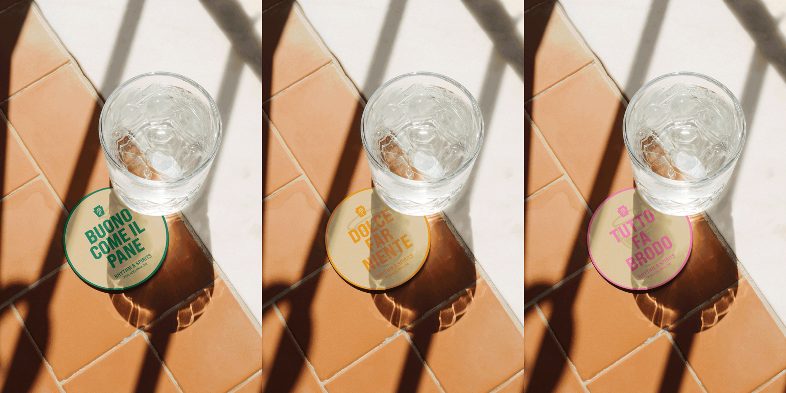
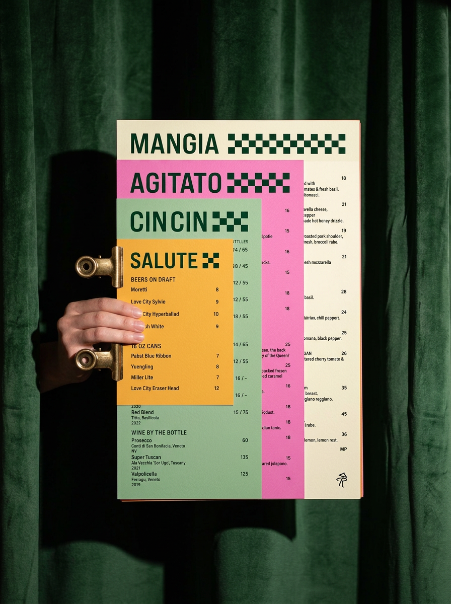
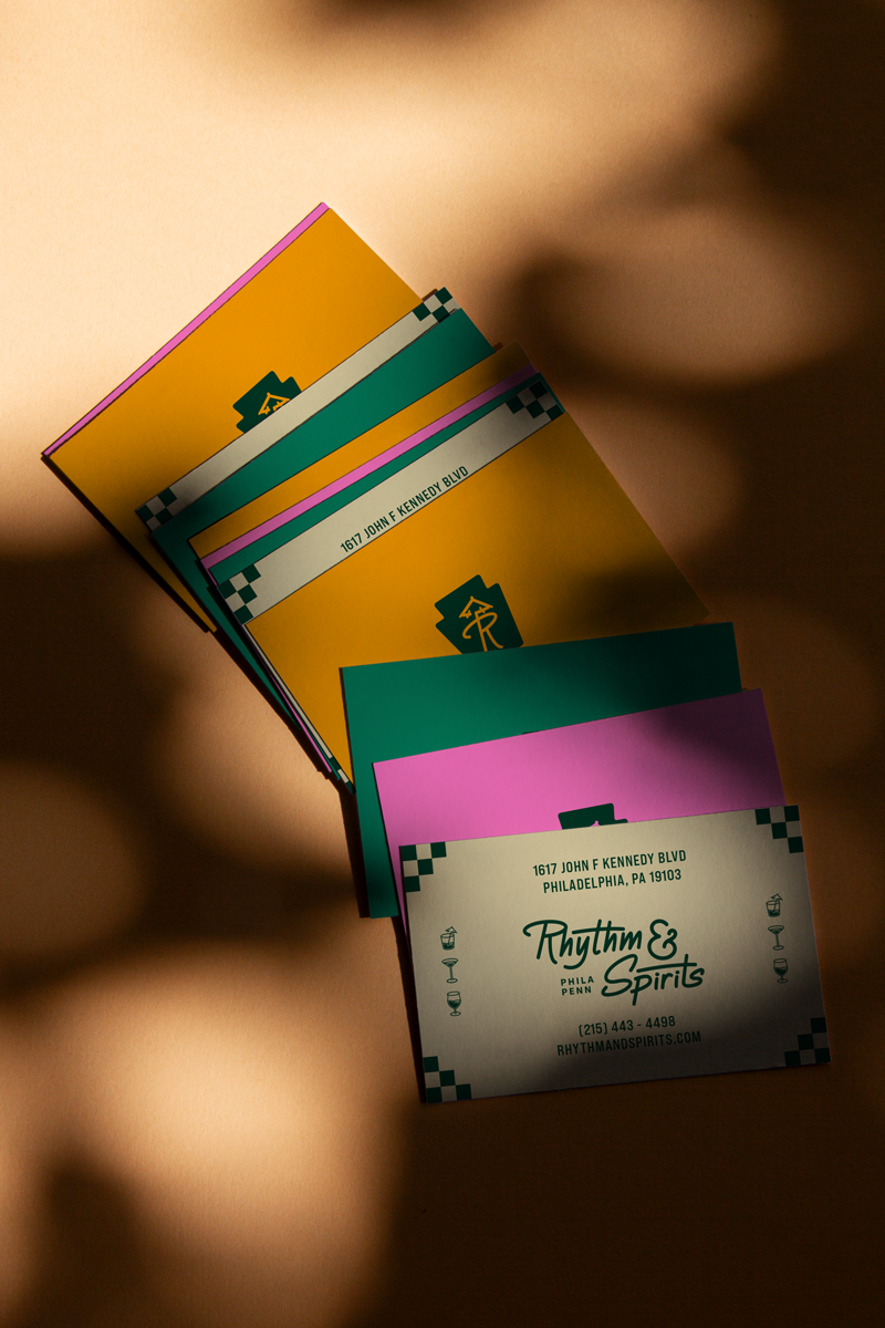
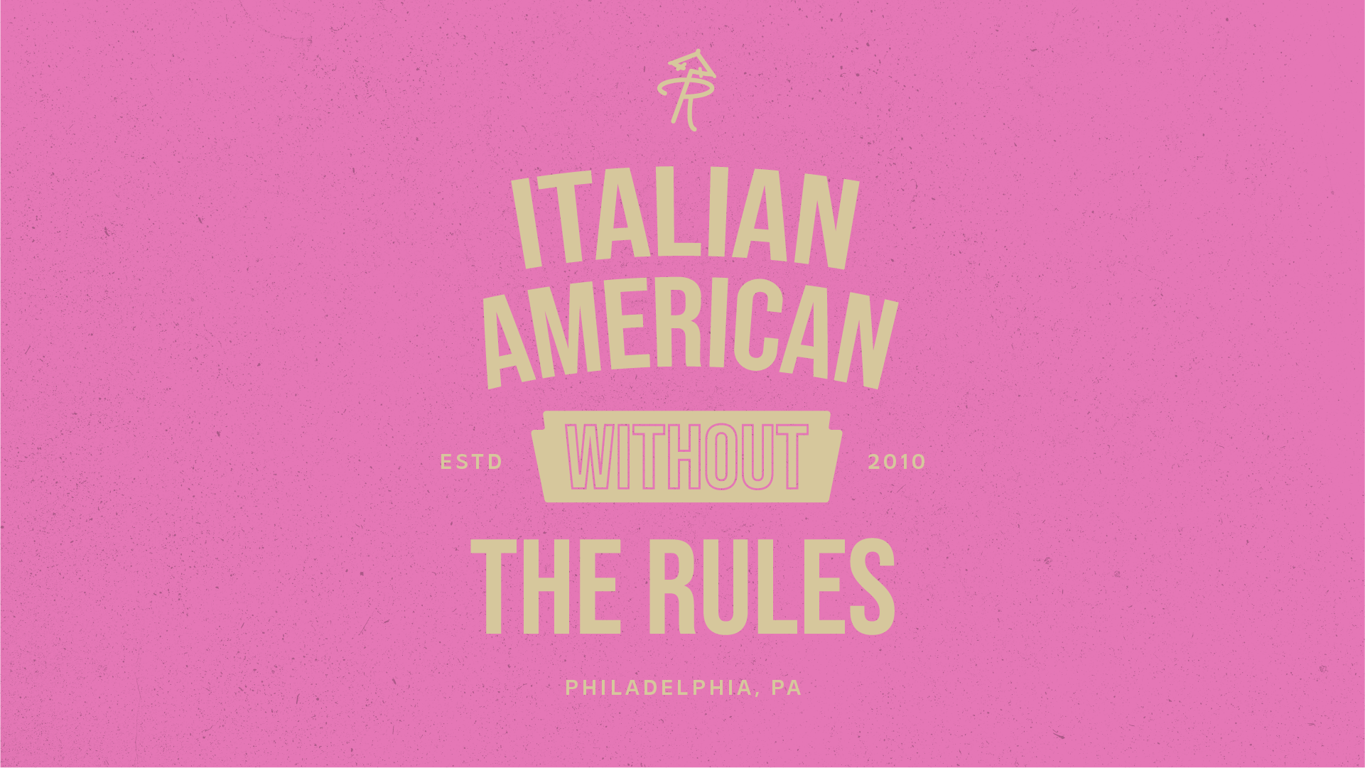
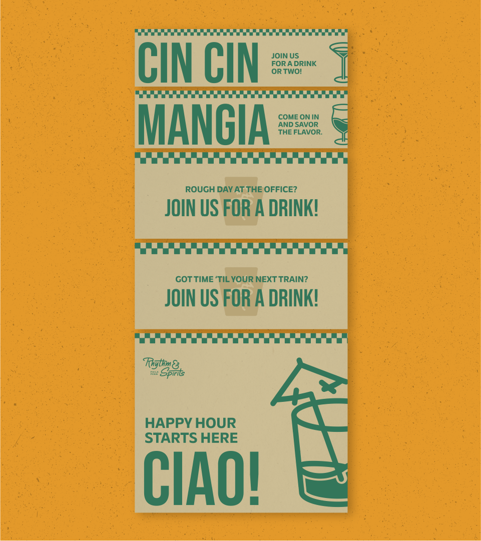
The initial concept hand off proposed 3 different ideas varying on where they placed on the spectrum of Italian/Island aesthetic. There was a clear winner from the beginning and thankfully the client trusted me and picked it from the jump. It was a concept that leaned heavily into the mono-line island illustration aesthetic that was called out in the moodboards. The issue left was how we were going to present the Italian influence on the brand. We decided that it could be represented throughout the brand system with a mix of color, brand assets and illustrations, and copy.In the end, we created the solution with a unique mix of boisterous colors with a tactile feel, a set of illustrated assets that helped convey the island vibes with an Italian influence, and copy that really set the tone for the experience displayed inside and out of the establishment.

rhythm & spirits
Brand Identity | Motion Design | Print Design
Rhythm & Spirits is a restaurant with roots in Atlantic City. Founded by its owner, Lee, in 2010, they recently decided to make the move to Philadelphia. With the move they wanted to apply a fresh coat of paint to the dated brand. An interesting concept of fusing old-school Italian food with a taste of the islands in their cocktails, they needed a brand that clearly represented that.
The initial concept hand off proposed 3 different ideas varying on where they placed on the spectrum of Italian/Island aesthetic. There was a clear winner from the beginning and thankfully the client trusted me and picked it from the jump. It was a concept that leaned heavily into the mono-line island illustration aesthetic that was called out in the moodboards. The issue left was how we were going to present the Italian influence on the brand. We decided that it could be represented throughout the brand system with a mix of color, brand assets and illustrations, and copy.In the end, we created the solution with a unique mix of boisterous colors with a tactile feel, a set of illustrated assets that helped convey the island vibes with an Italian influence, and copy that really set the tone for the experience displayed inside and out of the establishment.