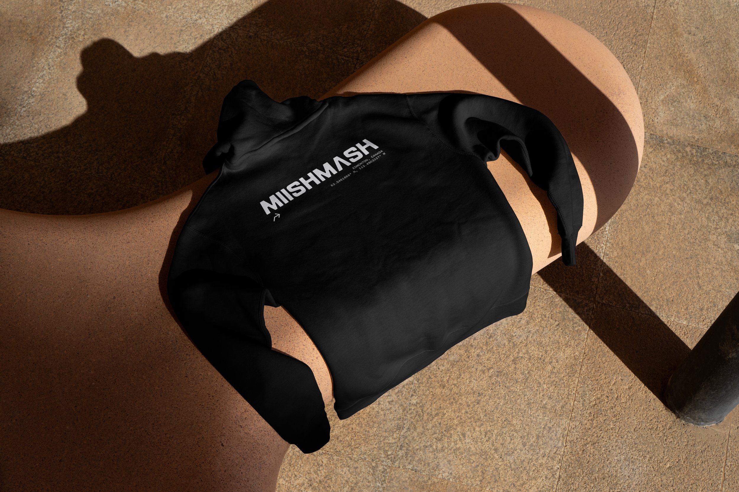
Miishmash
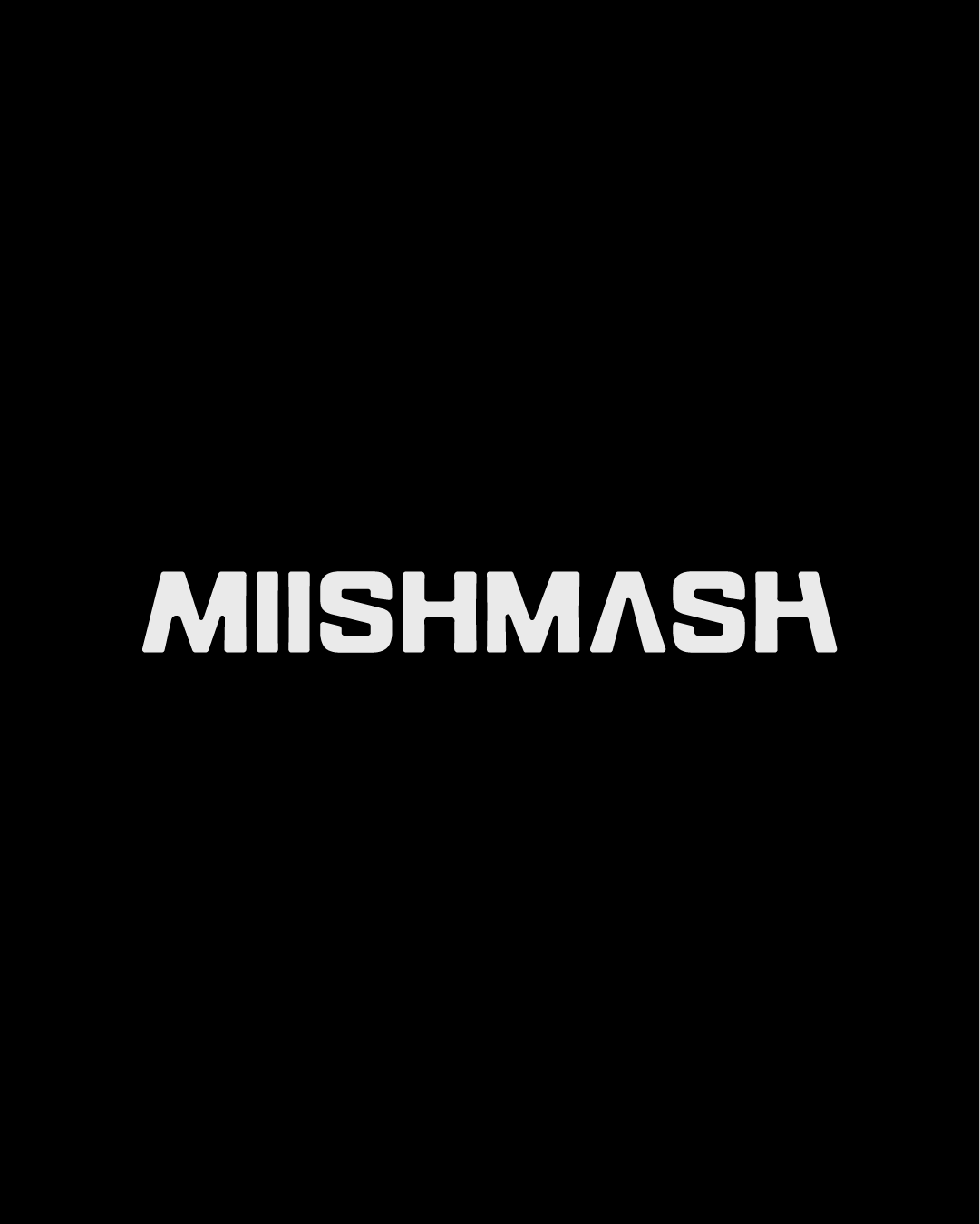
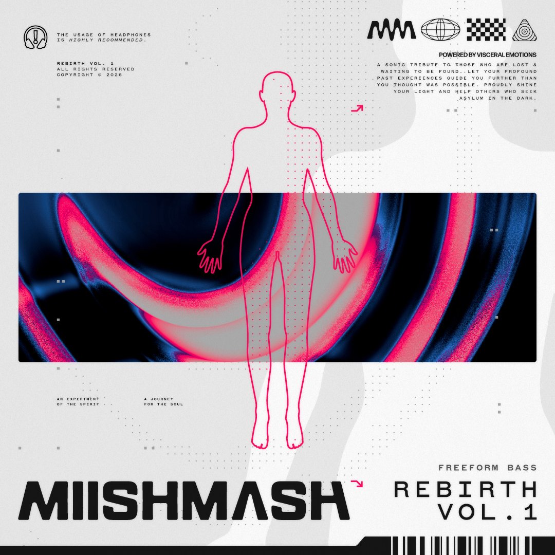
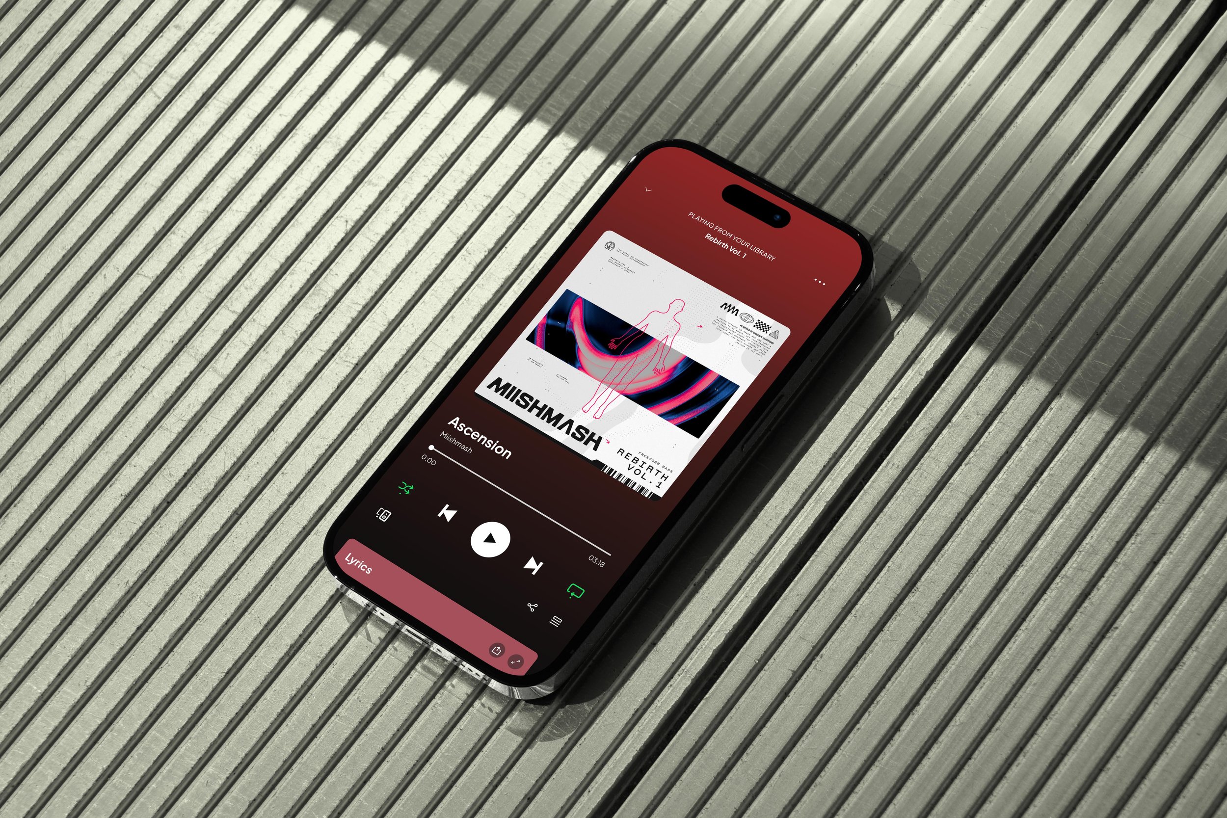
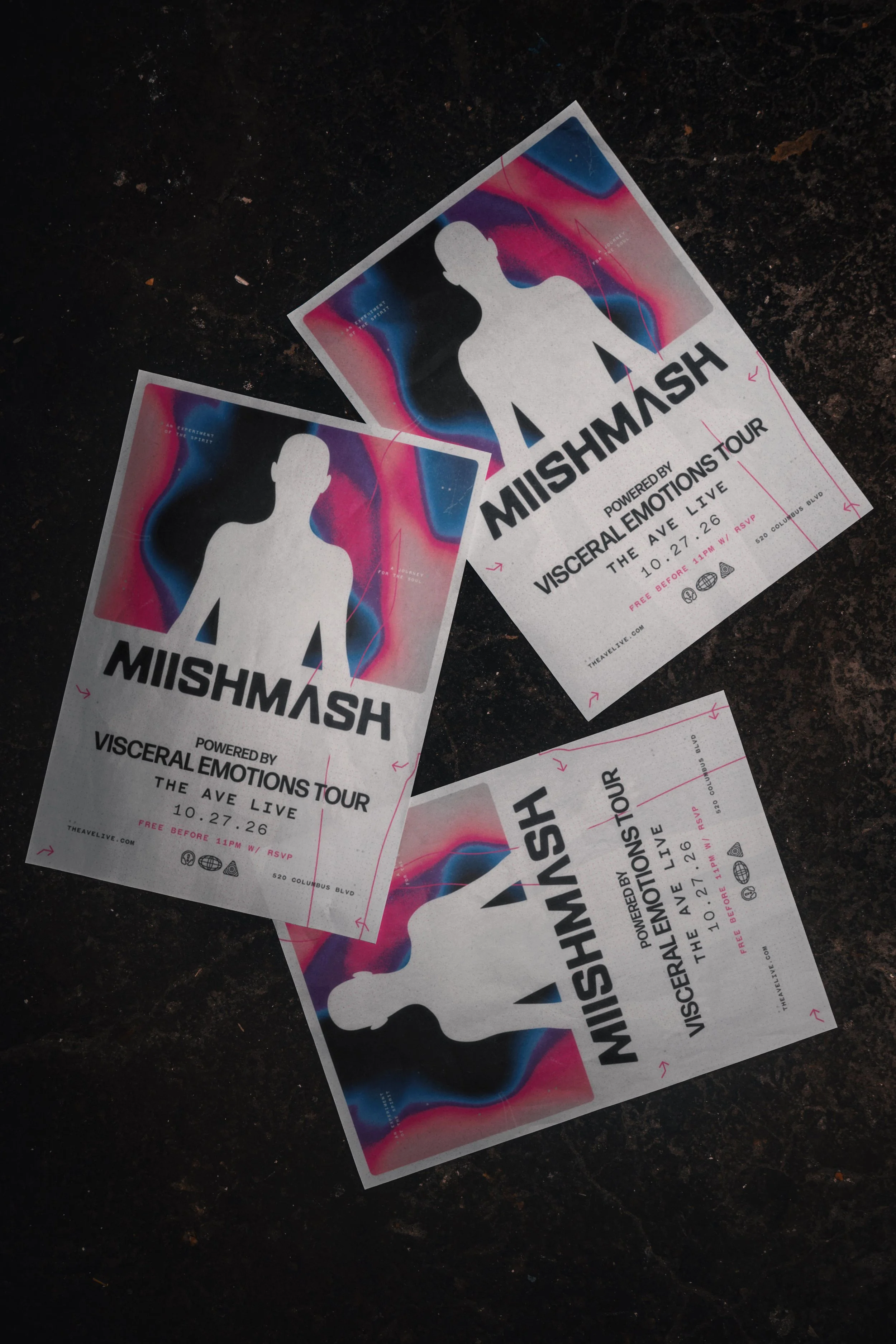
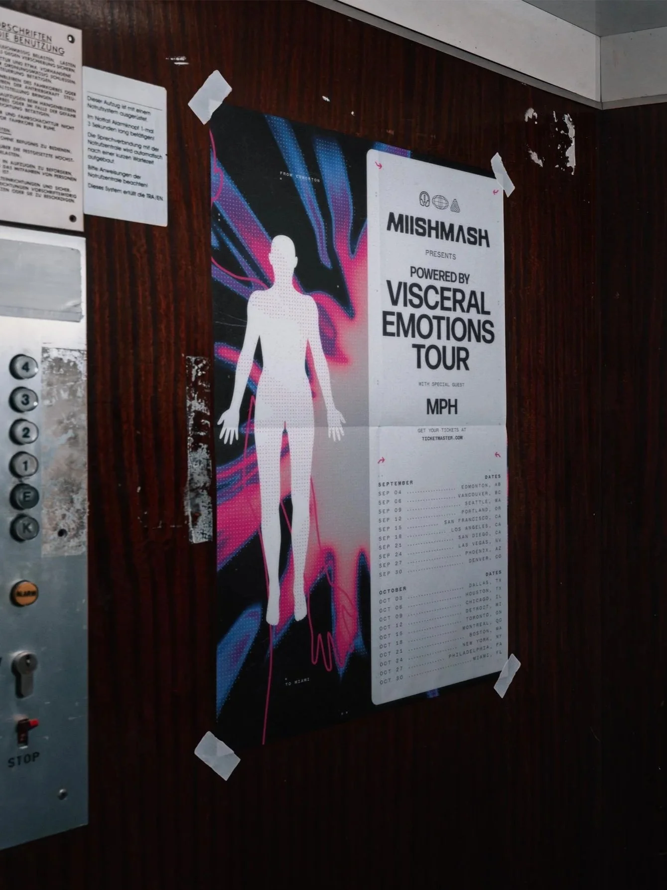
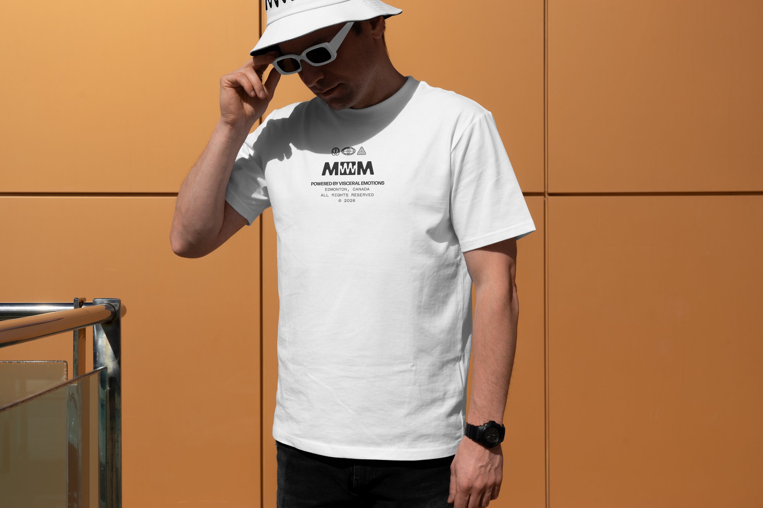
The client had approached me asking me if I was willing to work on his artist identity for his new bass music project he had created. He had a vision, something futuristic, recognizable; a wordmark that could be used in many different usage cases, but with enough spunk to hold its own on the mainstage.
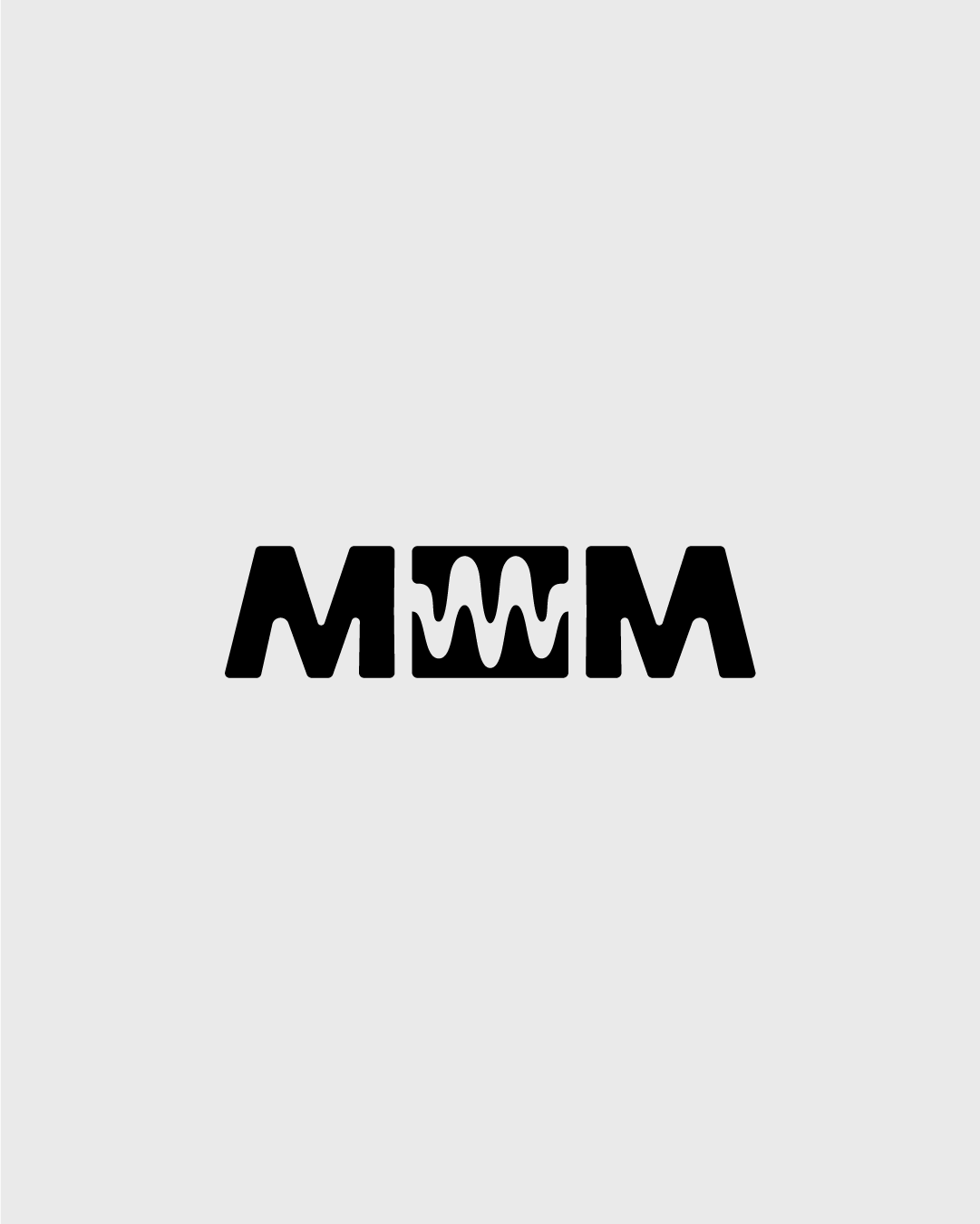
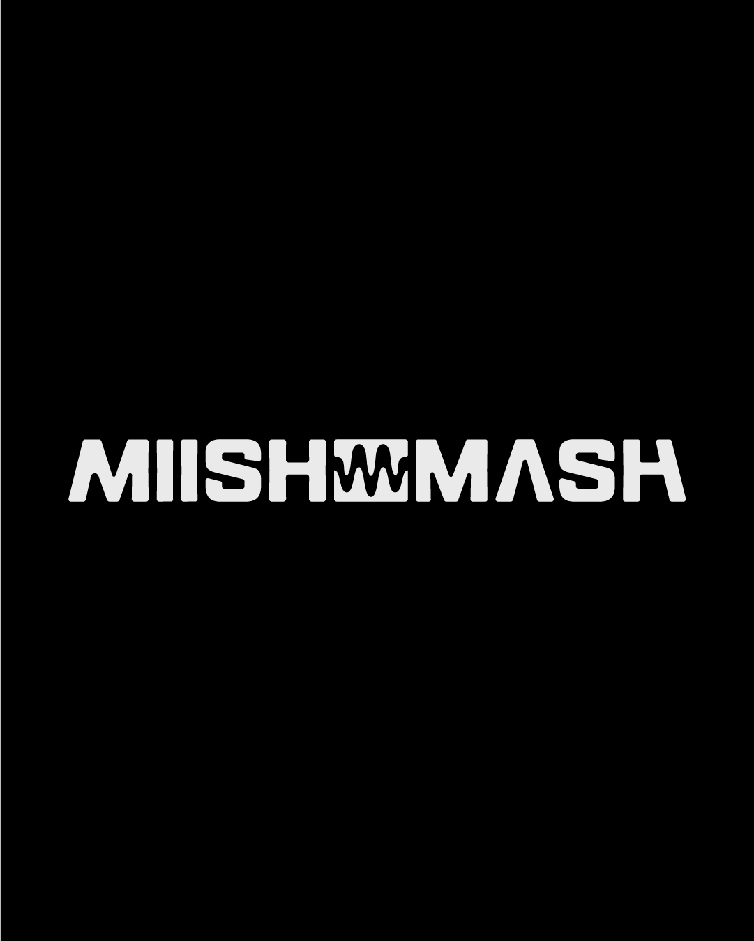
Armed with hundreds of artist identities and countless festival posters, tour announcements, and venue flyers we began to review and breakdown piece by piece. The goal to create a wordmark that would represent him in all usage cases, large and small. Initially, I created 3 concepts, but he had 2 favorites. The first direction was a wordmark that was very much inline with the provided inspiration: dynamic cuts in the typography, lowercase, sharp, and futuristic feeling, yet rigid. For the second concepts, I leveraged the meaning of the word “Mishmash” and designed a treatment easier on the eyes, with rounded corners, and a futuristic take on the typography and implemented the same logic for the logomark.
La Maya’s Blanco, Reposado, Añejo, and now Smoky Agave
Spirits have received much love from the community and the restaurant’s patrons. They continue to don it on their shelves and sell it at their bar as a fan-favorite for the taste and unique label design.

La Maya Agave Spirit
During the COVID quarantine, a colleague of mine and I decided to create our own brand. We chose the name "Smile Design Co.", as we wanted our designs to be cheeky and bring humor into the midst of a bleak time period. Based on our inherent heady aesthetics we created and mocked up these designs that we collaborated on.
We created an Instagram, asked people to preorder their shirts, and received a larger response than we could have ever hoped for. Moving forward with our many orders, we then printed, shipped, and marketed our t-shirts and stickers on our instagram, and eventually moved our sales platform to Etsy where it stands today.